炭笔画材
Charcoal Pencil
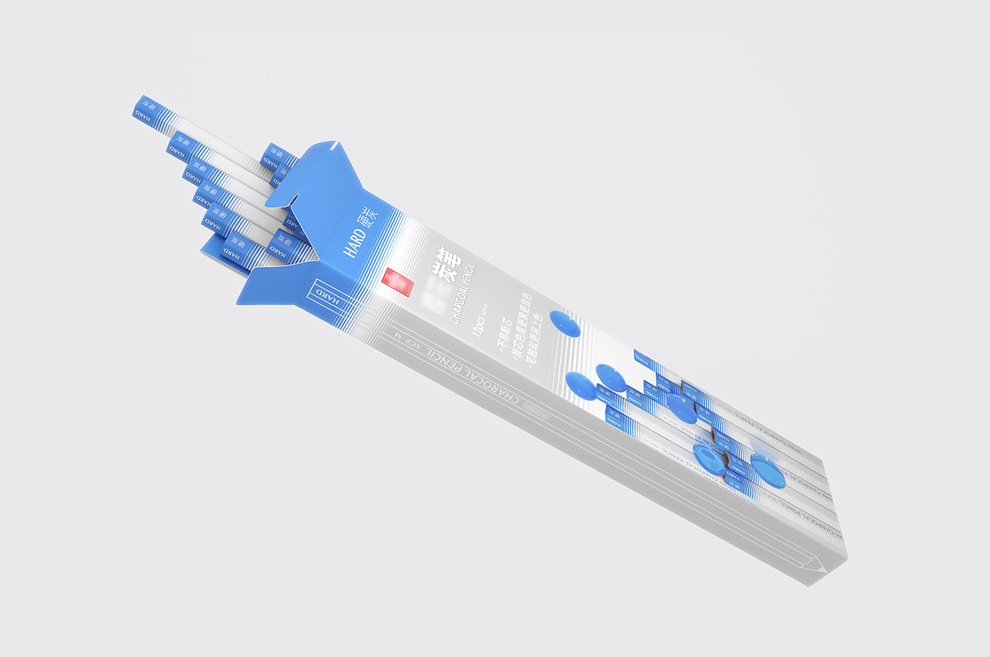
客户是全球知名的日本画材品牌,我们为其即将推出的系列炭笔进行了产品视觉及包装设计。本系列炭笔分为软、中、硬三个硬度。“点构成线,线构成面”这一绘画的基本逻辑,启发我们设计了该系列产品的以“渐变圆点”为核心的视觉系统。
笔身涂装设计,我们选择了和市面常见同类产品“深色暖色系”涂装反差较大的“浅色蓝色系”配色。笔身整体为灰色主体加尾端的白色及与硬度对应的色块。在视觉统一的同时,笔末端的色块可以非常清晰地指示硬度,以便使用者分辨。笔身的灰色部分可以防止使用者手指上可能存在的碳灰污染笔身,从而保证产品使用过程中持久的整洁美观。
笔盒的设计,我们基于“圆点”延伸出了“小球”元素。结合硬度的不同赋予了小球对应的颜色及质感,以便使用者更直观地感受其产品硬度的差异。
This client is a world-renowned Japanese painting material brand, and we have designed the product vision and packaging for its upcoming series of charcoal pencil. This series of charcoal pencil are divided into 3 hardness which are soft, medium and hard. The basic logic of the painting which is "dots form line, lines form surface" inspired us to design the visual system with the " size gradient dots" as the core.
For the coating design of the pencil body, we have chosen the light blue colors matching with the dark warm colors of the common similar products in the market. The whole body of the pencil is mostly gray plus white and a color block corresponding to the hardness at the end. While visually unified, the color block at the end of the pencil can indicate the hardness very clearly for the user to distinguish. The gray part of the pencil body can prevent the pencil body form being dusted by the carbon dust on the user's fingers, which situation can possibly affect the appearance.
For the design of the pencil cases, we extended the element of "small balls" based on the "dots". Combined with the difference in hardness, we gave the balls the corresponding textures, colors and hardness, so that users can visually experience the difference in hardness of the pencils more intuitively.
设计总监 Design Director / 罗昊祯
设计 Designer / 罗昊祯 林鹤
图片处理 Image perfection / 林鹤 黄娅婷